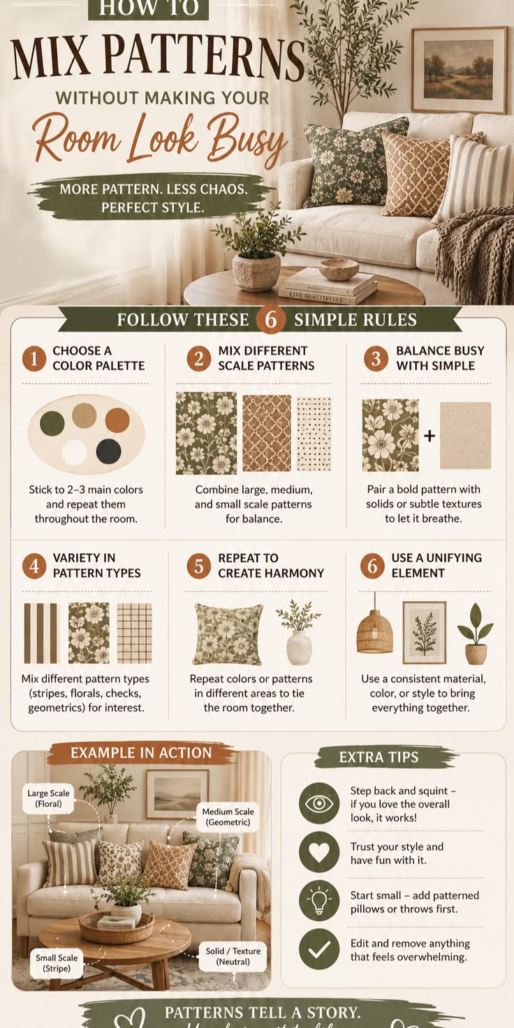

Creating a beautiful home is not about filling every space with colors, patterns, and decorations. It is about knowing how to combine different elements in a way that feels balanced, stylish, and welcoming. When colors and patterns work together, even a simple room can look elegant, modern, and expensive.
However, mixing too many colors, prints, textures, and decorative items can make a room feel crowded and disorganized. The secret is to create harmony by choosing a clear color scheme, balancing bold patterns with simple ones, and allowing enough empty space for the design to breathe.
Here are ten practical ways to mix colors and patterns without overdecorating your home.
1. Start With a Simple Color Palette
The first step is to choose a small group of colors that will guide your decorating decisions. A simple palette makes it easier to coordinate furniture, curtains, rugs, cushions, wall paint, and decorative accessories.
A useful approach is the 60-30-10 rule:
- 60% dominant color: The main color used on walls, large furniture, or other major surfaces.
- 30% secondary color: A complementary color used on curtains, accent furniture, or rugs.
- 10% accent color: A stronger shade used on cushions, artwork, lamps, or small decorative objects.
For example, you could use warm white for the walls, beige for the curtains and sofa, and dark green for cushions and decorative accessories.
This approach creates a balanced appearance without making the room look plain.
Remember that the 60-30-10 rule is a guideline, not a strict requirement. The best proportions depend on the size of the room, the amount of natural light, and your personal taste.
2. Combine Neutral Colors With Bold Accents
Neutral colors are excellent for creating a calm and sophisticated foundation. Shades such as white, cream, beige, greige, and light grey work well with many other colors.
Once you have established a neutral base, introduce one or two stronger colors to add personality.
For example, a living room with cream walls and a beige sofa can look more interesting with emerald-green cushions, a dark green accent chair, or a few pieces of gold-colored decor.
Similarly, light grey walls can be combined with navy-blue cushions and black decorative accessories.
The advantage of this approach is flexibility. You can change the accent colors later without repainting the entire room or replacing your major furniture.
Design tip: Let neutral colors establish the overall mood, then use bold colors selectively to draw attention to specific areas.
3. Mix Patterns of Different Sizes
Patterns can make a room more attractive, but using several patterns of the same size can create visual competition.
A better approach is to combine patterns with different scales.
For example, if your sofa has large floral patterns, choose smaller geometric patterns for the cushions. You could then introduce a subtle striped rug to complete the arrangement.
Large patterns attract attention, medium patterns create visual interest, and small patterns provide detail.
You can apply this principle to floral prints, stripes, geometric designs, abstract patterns, and traditional textiles.
The important thing is to avoid making every pattern equally bold. Allow one pattern to dominate while the others support it.
4. Choose One Main Pattern
When decorating a room, select one pattern that acts as the main visual feature. This might be a floral curtain, a geometric rug, patterned wallpaper, or a statement cushion.
Once you have chosen the main pattern, use simpler designs elsewhere.
For example, if you have bold patterned curtains, keep the sofa relatively plain and choose cushions with subtle stripes or solid colors.
If your rug has a dramatic geometric design, choose understated curtains and simple upholstery.
This creates a clear focal point and prevents the room from feeling too busy.
A room can contain several patterns and still look elegant, provided that they do not compete for attention.
5. Use Colors That Have Something in Common
One of the easiest ways to combine different patterns is to make sure they share at least one color.
For instance, you could combine a cream-and-green floral cushion with a green-and-white striped cushion. Although the patterns are different, the repeated colors connect them visually.
The same technique works with rugs, curtains, bedding, and upholstered furniture.
If your main pattern includes three colors, you can use one of those colors in another patterned accessory to create a coordinated appearance.
This method is particularly useful when mixing traditional African prints with modern interior designs. A patterned fabric can become the inspiration for the colors used in cushions, artwork, or other accessories.
6. Balance Bold Patterns With Plain Surfaces
Every room needs areas where the eye can rest. Plain surfaces help prevent patterns and decorations from overwhelming the space.
If you have patterned curtains, a textured rug, and decorative cushions, avoid adding bold wallpaper and heavily patterned furniture at the same time.
Instead, use simple wall colors and understated furniture to balance the stronger elements.
For example, a living room with patterned African-print cushions could have cream walls, a plain beige sofa, and a simple rug. The cushions would then stand out without making the room feel crowded.
The same principle applies to bedrooms. If you choose patterned bedding, keep the surrounding walls and major furniture relatively simple.
Remember: Empty space is not wasted space. It is part of good interior design.
7. Mix Textures, Not Just Colors and Prints
A room does not need many patterns to look interesting. Different textures can provide depth and character while maintaining a calm appearance.
Consider combining smooth cotton, soft velvet, natural wood, woven baskets, linen curtains, and metal finishes.
For example, a neutral living room could include a linen sofa, velvet cushions, a wooden coffee table, and a textured rug. Even if most of the colors are similar, the different materials make the room feel layered and sophisticated.
Texture is especially useful when decorating with a monochromatic palette, where several shades of the same color are used together.
A combination of smooth, rough, soft, and reflective surfaces creates interest without requiring additional colors or busy prints.
8. Consider the Size and Lighting of Your Room
The size of your room should influence the colors and patterns you choose.
In a small room, large, bold patterns covering many surfaces can sometimes make the space feel crowded. Lighter colors, restrained patterns, and carefully selected accessories often create a more open appearance.
In a large room, you have more freedom to introduce larger prints, deeper colors, and dramatic decorative features.
Lighting also affects how colors and patterns appear. Natural daylight can reveal the true character of many colors, while warm artificial lighting can make creams and beiges appear richer.
Before purchasing curtains, wallpaper, rugs, or upholstery, compare samples in the room where they will be used.
A pattern that looks attractive in a showroom may feel overwhelming when repeated across a large surface at home.
9. Decorate Gradually and Edit What You Have
One common decorating mistake is purchasing too many accessories at once. Cushions, artwork, lamps, ornaments, vases, and decorative objects can quickly accumulate.
Instead, decorate gradually.
Start with the essential pieces, such as your sofa, bed, curtains, rug, and main lighting. Then add a few accessories that complement your chosen palette.
Step back and observe the room before adding anything else. Ask yourself whether each item improves the design or simply occupies space.
You can also remove a few accessories to see whether the room looks calmer and more cohesive.
A well-decorated home does not need to display everything you own. Carefully selected objects often have more impact than a large collection of unrelated decorations.
10. Repeat Colors Throughout the Room
Repeating selected colors is an effective way to make a room feel connected.
For example, if you introduce dark green through cushions, repeat that color in a small artwork, a plant pot, or a decorative object.
If your furniture has black metal legs, you might repeat black in a lamp base or picture frame.
This does not mean that every object must match exactly. Instead, a few repeated colors create a visual connection between different parts of the room.
The same technique can be used throughout the home. You could use warm white in several rooms while introducing different accent colors in the living room, bedrooms, and dining area.
This creates continuity without making every room look identical.
Three Beautiful Color and Pattern Combinations to Try
Combination 1: Modern and luxurious
- Walls: Warm white
- Sofa: Beige or greige
- Curtains: Plain cream
- Cushions: Emerald green and subtle geometric prints
- Accessories: Black, brass, or gold-colored accents
This combination works well for homeowners who prefer a clean, sophisticated living room.
Combination 2: Warm and welcoming
- Walls: Light cream
- Sofa: Warm beige or brown
- Curtains: Neutral fabric with a subtle pattern
- Cushions: Terracotta, rust, or muted orange
- Accessories: Natural wood and woven textures
This palette creates a comfortable atmosphere and works particularly well with warm lighting.
Combination 3: Modern African-inspired style
- Walls: Soft white or beige
- Sofa: Plain charcoal grey or cream
- Cushions: Carefully selected African-print fabrics
- Rug: A subtle geometric pattern
- Accessories: Wooden furniture, woven baskets, and a few pieces of traditional artwork
This combination allows colorful patterns to stand out while keeping the room balanced and contemporary.
Conclusion
Mixing colors and patterns without overdecorating is about creating balance rather than following complicated rules. Begin with a simple color palette, select one main pattern, combine prints of different sizes, and balance bold designs with plain surfaces.
Use texture to add depth, repeat a few colors throughout the room, and remember that not every wall, cushion, or corner needs decoration.
The most important principle is this: let a few elements stand out while everything else supports them. When colors, patterns, furniture, and accessories work together, your home can look stylish, comfortable, and luxurious without feeling crowded.