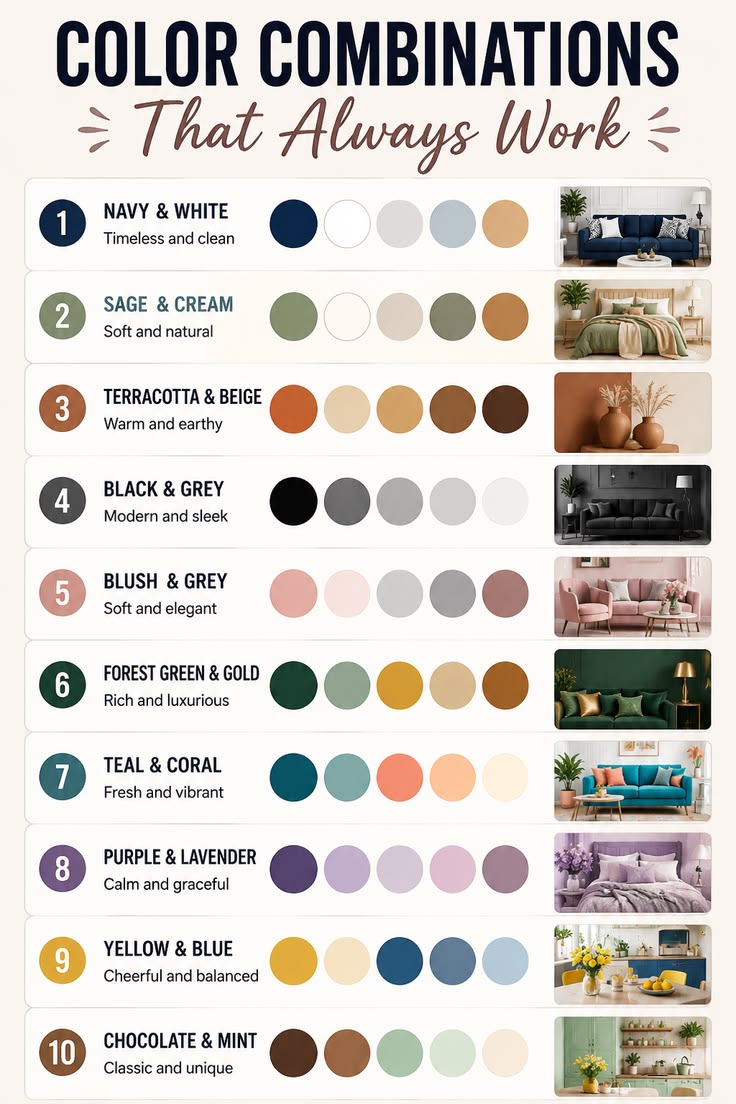

Choosing the right color combination for your home is one of the most important steps in creating a beautiful, modern, and welcoming living space. The colors you select can influence the appearance of your building, the atmosphere of each room, and the overall impression your home creates. A good color combination can make a small house appear more spacious, give a simple building a luxurious look, and make your home feel warm and comfortable.
However, choosing the right colors is not simply about selecting your favorite shades. You must consider your home’s architectural design, lighting, roof color, furniture, flooring, surroundings, and personal taste. With careful planning, you can choose colors that complement one another and give your home a stylish, balanced appearance.
1. Consider the Design of Your House
The first step in choosing the right color combination is to consider the architectural design of your home. Different house designs look best with different color schemes.
For example, modern duplexes often look attractive with warm white, charcoal grey, and black accents. These colors create a clean, sophisticated appearance that highlights the building’s structure.
Traditional houses may look beautiful in cream, beige, and brown, while minimalist homes often benefit from white, light grey, and subtle dark accents.
If your house has decorative pillars, balconies, or special exterior features, you can use a complementary color to highlight them. However, avoid using too many contrasting colors, as this can make the building look crowded.
The goal is to select colors that enhance the architectural design rather than distract from it.
2. Choose a Main Color First
A successful color combination usually begins with one dominant color. This is the main color that covers the largest area of your home.
For the exterior, popular choices include warm white, cream, light grey, beige, and greige. These colors are versatile and can be combined with many other shades.
For interior walls, warm white, soft beige, light grey, and pale green can create a comfortable and attractive atmosphere.
When choosing your main color, consider the appearance you want to achieve. White can create a bright, clean look, cream provides warmth, grey offers a contemporary feel, and beige creates a soft, natural appearance.
Once you have selected your main color, choose one or two additional colors that complement it.
3. Follow the Three-Color Rule
One simple way to create an attractive color scheme is to use three colors: a dominant color, a secondary color, and an accent color.
- Dominant color: Covers most of the walls and establishes the overall appearance.
- Secondary color: Adds contrast and can be used on selected walls, pillars, or architectural features.
- Accent color: Provides finishing touches on doors, window frames, railings, or other details.
For example, a modern house could have warm white as the dominant color, charcoal grey as the secondary color, and black as the accent color.
For a warmer design, you could use cream, coffee brown, and white.
Using a limited palette helps your home look coordinated and elegant. It also makes it easier to match other finishes, including doors, tiles, furniture, and curtains.
4. Consider Your Roof Color
Your roof is an important part of your home’s exterior appearance. The wall colors should complement it to create a balanced overall design.
If your roof is black or dark grey, warm white, light grey, and greige are excellent choices. These colors create contrast and give the building a modern appearance.
If your roof is red or brown, cream, beige, ivory, and warm grey can work beautifully.
If your roof is blue or green, consider neutral wall colors such as white, light grey, or cream to prevent the exterior from looking too busy.
Before making your final decision, compare paint samples with the roof in natural daylight. A color that looks attractive on its own may appear different when placed beside your roof.
5. Pay Attention to Lighting
Lighting can significantly change how paint colors appear. A shade that looks bright in a paint shop may look darker or warmer when applied to your walls.
For exterior walls, observe how sunlight falls on different sides of your building. Strong sunlight can make some colors appear much brighter, while shaded areas may look darker.
For interior spaces, rooms with plenty of natural light can accommodate a wider range of colors. Rooms with limited natural light often benefit from lighter shades, such as warm white, cream, and pale beige.
Artificial lighting also matters. Warm lighting can make cream and beige appear richer, while cooler lighting can emphasize grey and blue undertones.
The best approach is to test your preferred colors on a small section of the actual wall and observe them at different times of the day.
6. Match Colors With Your Furniture and Finishes
For interior decoration, your wall colors should work well with your furniture, flooring, curtains, kitchen cabinets, and other finishes.
If your furniture is brown or made from natural wood, cream, warm white, and beige can create a harmonious appearance.
If you have black, grey, or white furniture, light grey and white walls can produce a modern look.
For homes with colorful furniture or decorative accessories, neutral walls can help maintain balance without competing for attention.
You should also consider the floor tiles. Beige or cream tiles often work well with warm wall colors, while grey tiles can complement white, greige, or light grey walls.
It is not necessary for every item in your home to match exactly. Instead, choose colors that complement one another and maintain a consistent style throughout the space.
7. Choose Colors According to Each Room
Different rooms serve different purposes, so you do not have to use the same color throughout your home.
- Living room: Warm white, greige, cream, or light grey creates a welcoming and elegant atmosphere.
- Bedroom: Soft beige, pale grey, muted green, or warm white can encourage a calm feeling.
- Kitchen: White, light grey, and cream create a fresh appearance and coordinate with many cabinet designs.
- Bathroom: White, pale grey, and soft blue can create a clean, refreshing look.
- Hallway: Light neutral colors can help narrow or poorly lit spaces feel more open.
Although each room can have its own color scheme, using related shades throughout the house helps create a sense of continuity.
For example, you could use warm white throughout the main areas and introduce sage green in the bedroom or a subtle greige feature wall in the living room.
8. Consider Your Environment and Climate
Your surroundings should also influence your choice of exterior paint colors.
In a sunny climate, light-colored exterior walls can reflect more sunlight than dark walls. Warm white, cream, and light beige are therefore practical options for homes exposed to strong sunshine.
In areas with frequent rain, humidity, or dust, choose exterior paint designed for the local conditions. The paint should be suitable for the wall surface and provide appropriate resistance to weathering, moisture, and fading.
Also consider the appearance of your compound, fence, gate, landscaping, and neighboring buildings. Your home does not have to match surrounding buildings, but its colors should create a pleasing overall appearance.
9. Avoid Common Color-Selection Mistakes
Even beautiful colors can produce a poor result when they are not combined carefully.
Avoid using too many strong colors on the same exterior. Excessive contrast can make the house look disorganized.
Do not choose paint based only on a small color chart or a photograph. Screens, printed samples, and shop lighting can distort the actual shade.
Avoid selecting a color without considering your roof, flooring, furniture, and other permanent finishes.
Finally, do not overlook preparation and paint quality. Uneven surfaces, peeling paint, dampness, and poor application can reduce the beauty of even the best color combination.
10. Test Your Colors Before Painting
Before buying paint for the entire house, purchase small samples of your preferred shades.
Apply them to separate sections of the wall and allow them to dry completely. Observe how they look in sunlight, shade, and artificial lighting.
Compare the colors with your roof, doors, windows, flooring, and furniture. If possible, look at the samples for several days before making your final choice.
This simple step can help you avoid expensive mistakes and ensure that you are happy with the finished appearance.
Conclusion
Choosing the right color combination for your home requires a balance of personal preference, architectural design, lighting, and practicality. Start with one main color, add a complementary secondary shade, and use an accent color sparingly. Consider your roof, furniture, flooring, and surroundings before making your final decision.
For a modern and luxurious exterior, warm white, charcoal grey, and black accents are an excellent starting point. For a warm and welcoming appearance, consider cream and coffee brown. For a contemporary and understated design, greige and dark grey are also excellent options.
Remember that the most beautiful home is not necessarily the one with the most expensive paint or the greatest number of colors. It is the one where the colors work together harmoniously, the finishes are carefully applied, and the overall design reflects the homeowner’s taste.